How Healthy is Your Healthcare Website? Part 1: Anatomy of a Healthcare Website Design
Ready to boost your SEO ?

How Healthy is Your Healthcare Website? Part 1: Anatomy of a Healthcare Website Design
Users strongly prefer website designs that look both simple (low complexity) and familiar (high prototypicality)... An online visitor’s first impression of your site is formed in less than fifty milliseconds. (Google study)
Healthcare website design requires a rigorous design approach to simplify complex digital experiences. This includes improving ease of use, accessibility, and accomplishing marketing goals. While other types of websites, such as retail, focus on inspiring people to desire the brand, healthcare websites need to provide an easy-to-use platform for increasing knowledge and accomplishing tasks.
Let’s first break down the anatomy of the UX/UI design for desktop (mobile will be addressed separately) and then look at each in more detail and how it contributes to the User Experience (UX) design.
- Header
- Mega Menu
- Content
- Footer
- Overlays
1. HEADER
Let’s first look at the different parts of the desktop header:

The default placement of the logo is the upper left and the overall composition of a logo should be simple. Its role is to assure the user they are at a credible site and visually distinguish the brand in a simple, compelling way. Ironically ‘getting to simple’ can be complex but once achieved it has numerous benefits. The fewer colors, letters, and design elements, the less time it takes to parse what a logo means, making for a positive experience.
Note how the logo is by itself on the left with plenty of ‘air space’ i.e. no other objects should invade the space surrounding the logo. This visually distinguishes the branding area and allows the layout to breathe.
Primary Navigation
This is the row of links that provide access to the website content and should be 6 links or less. This simplifies the header and gives adequate room for the logo. Note whenever words are omitted they become simpler and easier to use. For example, instead of saying About Us, Contact Us, and Our Services it’s simpler and just as easy to understand to say About, Contact, and Services.
Admin Navigation
The administrative navigation above the primary navigation, should be a slightly smaller text size and populate the upper right of the screen. This is for logging in, search, and other functions such as displaying the name of the person who has logged in. These links are often represented by icons to differentiate from the primary navigation and further simplify the header.
Hamburger Menu
A ‘hamburger’ menu is comprised of 3 horizontal lines for the navigation or a variation of such. Originally a mobile-only convention, the hamburger icon was such an effective and elegant solution that it’s now used with desktop designs as well. The hamburger menu includes the primary navigation, admin navigation, and other mega menu content when appropriate. The hamburger is the most efficient way to display navigation and simplify the header, however, it’s still not widely accepted by audiences unfamiliar with how to use it and is often not ADA compliant. For these reasons, a hamburger menu on desktop is typically not advisable for healthcare websites.
2. MEGA MENU
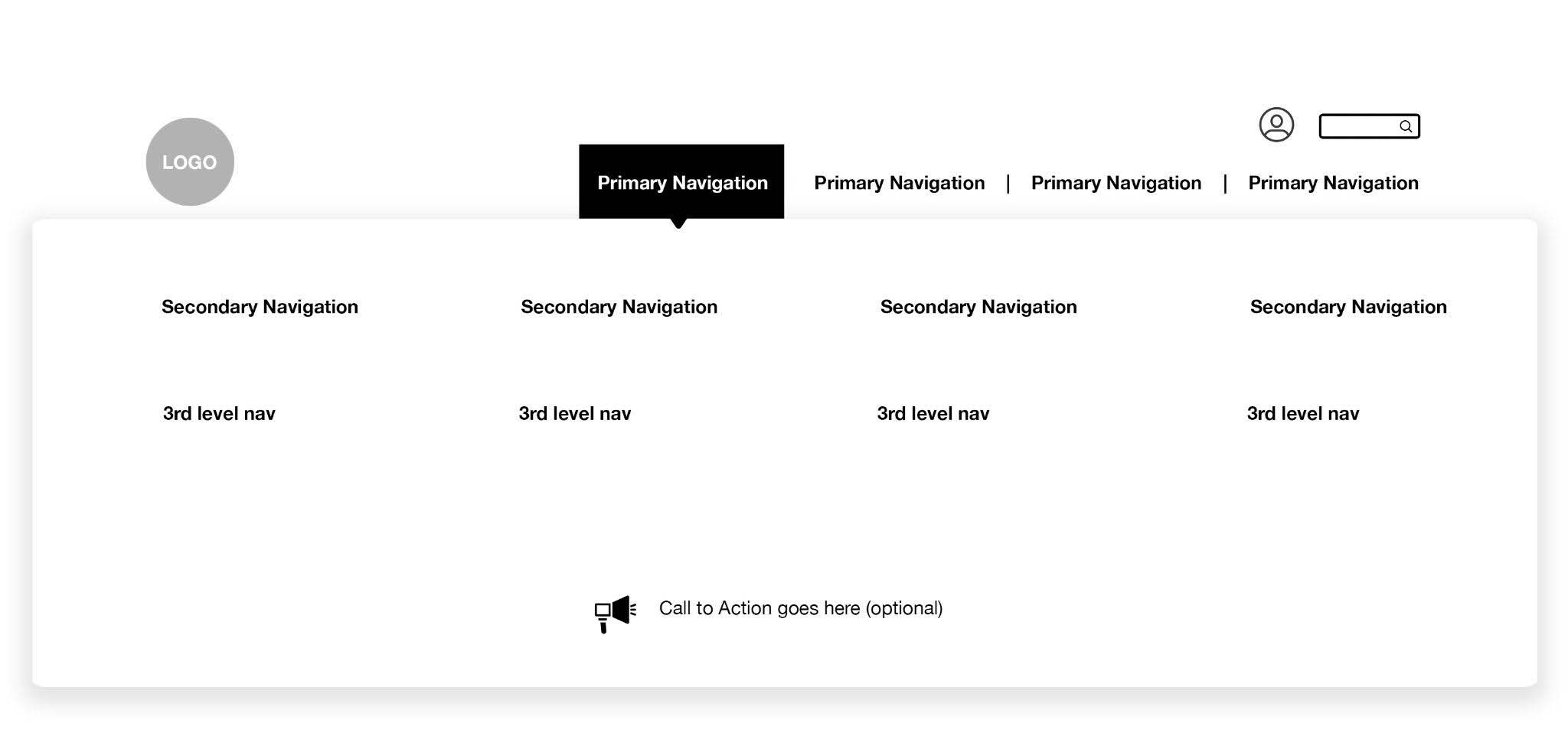
Mega menus have increased in popularity since they convey large amounts of link information simply on desktop. They can also be used to highlight a call to action or visual imagery that aids in understanding the different sections of the site, though the addition of these elements can be visually complicated and confusing. Mega Menus are best when they extend edge-to-edge to simplify the layout and figure-ground. Navigation is best when persistent for the whole site and mega menus are a great way to display the information architecture including primary, secondary, and third-level navigation.
3. HERO

The Hero area is just below the header on the home page. This is a key location to communicate an aspirational statement and/or a unique selling proposition (USP).
The hero is called a hero since it should be strong both visually and with words. This typically means it includes a simple, singular, strong graphic image, a short headline, and a brief sub-headline.
The hero should also include a Call to Action to move the user along the funnel to the desired landing page. Sometimes 2 CTAs are acceptable as long as the hero doesn’t become too complicated visually.
4. CONTENT

The content area below the hero row traditionally used a multi-column layout to display different types of content similar to a newspaper layout. Since the web is such a complex visual environment, a row-based design is considered effective since it simplifies the layout and focuses the user on one type of content. Rows are easier to read than columns since the content doesn’t compete with each other when viewed side by side.
Note the example above includes a row with 3 sections. This is popular since it’s more visual with less text. On average people read 20% of the words on a web page so when there’s less text, then there’s less overlooked copy. The more visuals that can communicate information the better. It can be helpful to view row-based words and images as signage on a highway since users are moving fast toward the content they are looking for.
A few specs regarding content:
- The width of a single text column should be about 12 words or 75 characters. Studies show this is the optimal width for readability.
- The text size should be 16px or greater and the line height 24px or greater. Line height is related to type size so if the type size is larger than 16px then the line height should be as well.
- The paragraph font most often should be a sans serif typeface and only a few font families should be used per website. Popular fonts include Montserrat, Roboto, and Lato. Montserrat is effective since it has 17 weights, including Thin, Light, Regular, Medium, Bold, and Black as well as condensed styles. Fonts are a subset of Typography which is critical for a well-designed site.
- Approximately 3 colors should be used indicating functionality when appropriate (hover, on-state, and off-state). Using more than 3 colors creates a complex visual environment making the site harder to use. People parse color first, in less than a second so the proper amount and use of colors is critical.
- Most Healthcare sites need to be ADA compliant which limits colors and complex content displays. See more about ADA compliance and the most recent WCAG 2 standard.
- Images should work graphically i.e. as a shape within the user interface. An ample amount of time should be spent searching for or creating the right imagery. Often the quality of images is overlooked which greatly diminishes the site design.
These are not hard and fast rules. It’s perfectly acceptable to have multi-column layouts for a content row. The guiding principle is to communicate information with a minimum amount of gratuitous design elements. The simplicity highlights content, which is the most important part of the design.
Sidebar
Since Healthcare websites are often complex with large amounts of information, sidebars are an effective way to aid navigation and call-outs. Sidebars like logos should have generous amounts of white ‘air-space’ around them to distinguish themselves from content. Using icons and different typography styles also helps to distinguish the sidebar. The sidebar is typically used to display persistent secondary and third-level navigation for the section it’s in.
Related Content
Once a site visitor has reached the bottom of the page content, it makes sense to display related content. Here are some examples.
- Image-Based Row: A row of related content that includes a thumbnail image, title, and the first few lines of the text of the page. The title and image link directly to the related content and/or a read more link can be autogenerated.
- Categories: A list of categories related to the page content such as blog categories or categories that comprise the content taxonomy of the site. These link to a category results page that lists all of the articles associated with that category. The results page can be styled with images and advanced search filtering and sorting controls helping the user find what they are looking for as well as inspiring them with visual thumbnails.
- Tags: These are similar to categories often used with blogs. These link to a tag results page that lists all of the articles or posts associated with that tag.
Since there is often a large amount of information on a healthcare website, using related content is an effective way to increase access to pages and increase the time on site. These tactics in effect ‘de-silo’ content so users can better understand what is on a website and more easily access it.
5. FOOTER
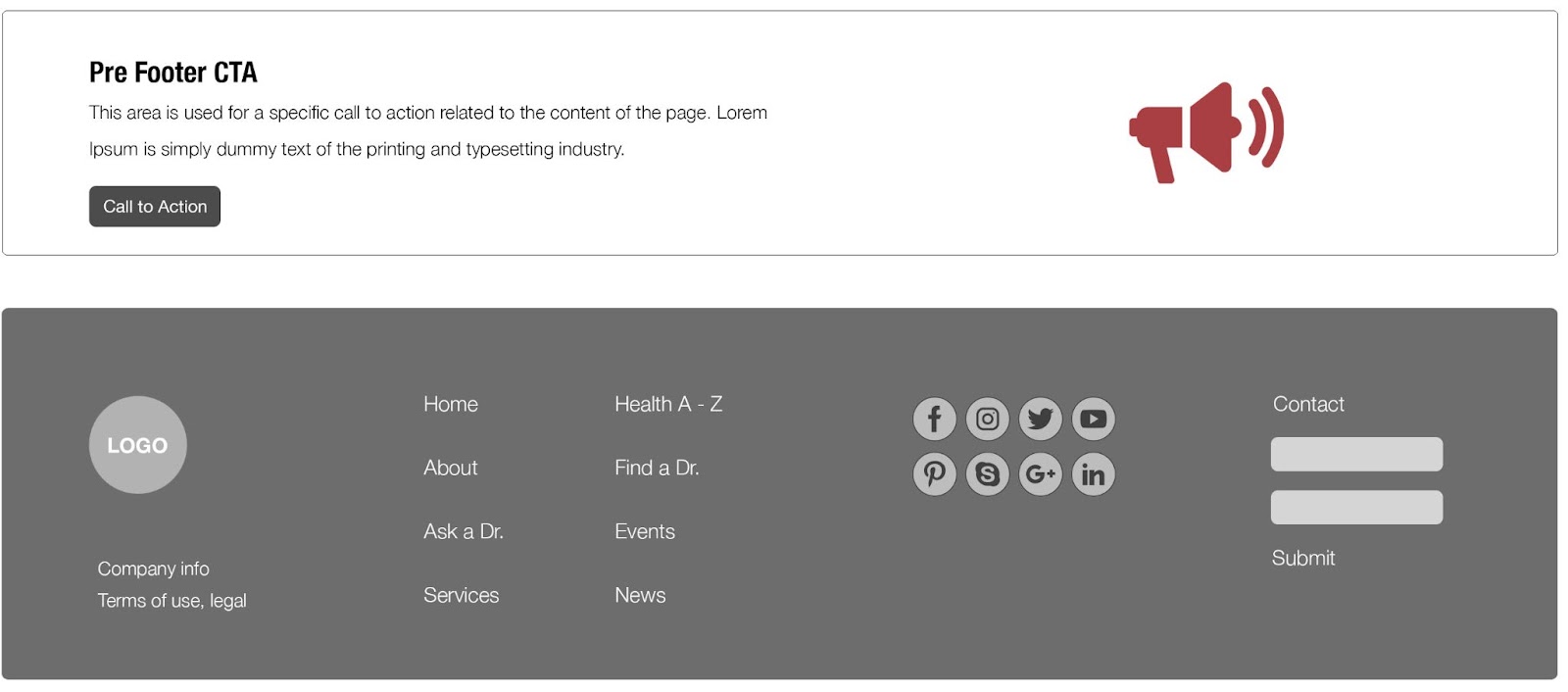
Pre-Footer
The pre-footer is an effective convention for displaying a CTA specific to that page. Since people read from top to bottom, it makes sense to have a CTA at the bottom since if the user has made it that far they have shown interest in the content and brand. Often the CTA is not customized for the page or section of the website but it’s a best practice since the more inline the CTA is with the contents of the page the more chance for conversion. See above an example of a pre-footer.
Footer
The footer displays:
- Information about the company/organization, address, contact information, legal information such as the terms of use for the site, copyright, and trademark indicators.
- Select primary navigation that often mimics the primary navigation at the top of the page. Since it’s now common to have a ‘sticky header’ nav bar then displaying navigation in the footer is not needed when there is a sticky header.
- Links to social media sites.
- If a secondary footer CTA isn’t in place often there will be a CTA in the footer e.g. subscribe to our newsletter or a more general contact CTA.
- Credits to those who created the site.
OVERLAYS
This refers to features such as chatbots and popups.
Chatbots have become more sophisticated, incorporating AI and Machine Learning so they don’t require a live person to respond. Chatbots now direct people to a knowledge base of pre-answered questions.
Drift has gained popularity for its AI capabilities though it’s become quite expensive. Drift employs ‘playbooks’, which are customized workflows that help visitors find what they are looking for or offer the option to chat directly or schedule a time to speak with a person. Read more - Why Your Healthcare Website Needs a Chatbot Now.
Pop-ups are often annoying but effective when used appropriately. The average conversion rate for pop-ups is 3% which adds up when there’s a significant amount of traffic. Well-designed pop-ups can convert at 10% or higher. They can be designed to display after a certain amount of time, typically after 4 seconds is best, or only when a visitor has scrolled lower on the page. They can also display with exit intent i.e. when someone clicks on a link to another site, a pop-up with an offer is displayed. There are many types of Pop-ups and they are increasingly utilizing AI to personalize messaging, offers, and behavior.
SUMMARY
Understanding the anatomy and best practices for UX/UI design is the foundation for optimizing the performance of a healthcare website. Furthermore, since Healthcare services are complex, the simplicity of the UX/UI is paramount. Users love simple and familiar designs as the Google study confirms. What has become clear over the years, especially with the increased adoption of mobile devices, is the need for simplicity. Scrolling is perfectly acceptable. Utilizing established conventions for the header, hero, content rows, pre-footer, footer, and overlays is key to maximizing the health of a healthcare website.


with a Booster program for Healthcare companies.