You look fabulous! How to update your logo on a budget
Ready to boost your SEO ?
You look fabulous! How to update your logo on a budget
A logo is THE most important visual symbol of a company's branding. It establishes the look and feel of the overall identity, builds recognizability, and establishes trust, yet it is often the most under-invested in element in many organizations. When logos age or become tired, the cost and time investment of having work done can be an obstacle. But revising or re-designing a logo doesn't have to be expensive. To keep costs low for clients on a modest budget, we have suggested approaches like a simplified typographic logo, presenting less options in the initial rounds, or offering limited revisions. Another popular approach is a logo “refresh.”
Did you have work done?
Think of a logo “refresh” as a day at the spa rather than going under the knife. With less down-time than a redesign, a refresh involves preserving some original pieces like colors, fonts, or graphic elements with slight modifications. This also allows an organization to hold off on redesigning and re-printing stationery, business cards, signage, t-shirts, and promo pieces until the old stocks start to run low.
We recently took the refresh approach with the logo for Concord Conservatory of Music (CCM) here in Concord, MA. By retaining the dotted eighth note graphic and original font, we were able freshen up their look, allowing CCM to phase their new logo into their materials as they were created.
Before:![]()
After:![]()
Boston-based private equity firm, BPEA, also opted for the day spa approach rather than a complete redesign. Keeping their brand colors was a top priority in part because their office copiers had been optimized to print their brand colors accurately – which was no small feat! As a well-established organization and recognizable brand to their clients we also suggested keeping the four squares as their recognizable brand mark.
Before:![]()
After:![]()
The final example is a logo refresher for Journey into Education and Teaching (JET), a nonprofit organization which helps paraprofessionals become school teachers in Massachusetts. The client requested to keep the italic font style from the original logo because the energy and forward motion of the italic text represents moving closer to the goals of becoming a teacher.
Before:![]()
After: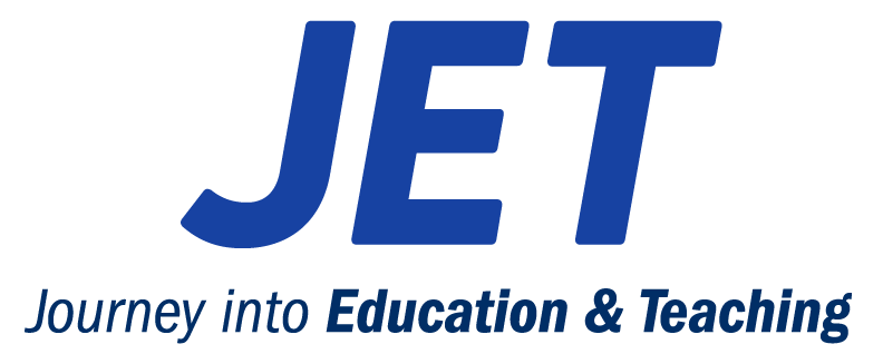


with a Booster program for Healthcare companies.