Website Redesign Best Practices: Understanding How People Use Sites Helps Improve the Design
Ready to boost your SEO ?
Website Redesign Best Practices: Understanding How People Use Sites Helps Improve the Design
Understanding how people use websites is an important part of understanding how to design them. As part of a series on usability and user experience, this post on website redesign best practices considers how your user interacts with your website as a way to inform its design.
Website Redesign Isn’t Just About the Home Page
Web design and websites aren’t about control. They’re about ideas and access. People typically don’t follow navigation structures laid out in sitemaps, they take asynchronous paths. Site redesigns often focus on the home page, but many website visitors may never see the home page. Instead, visitors come in from a Google search to an interior page.
Websites are often designed with a false narrative in mind, i.e., the visitor comes to the home page, scans the navigation, clicks on a secondary navigation link, reads a page and then clicks on a third level page. Web design reviews often show these pages in succession. While some people may follow that path, most won’t. More often than not a person asks a question on Google and lands on a page inside the site. They either scan that page or a summary on the Google results page and then leave.
Most website redesigns also will focus on the "above the fold" section of the home page.
Yet these two stats tell a different story:
"55% of people spend fewer than 15 seconds on a page." And "66% of attention on a page is spent below the fold."
-Time Magazine
What can we learn from thinking in these terms about how to design a website?
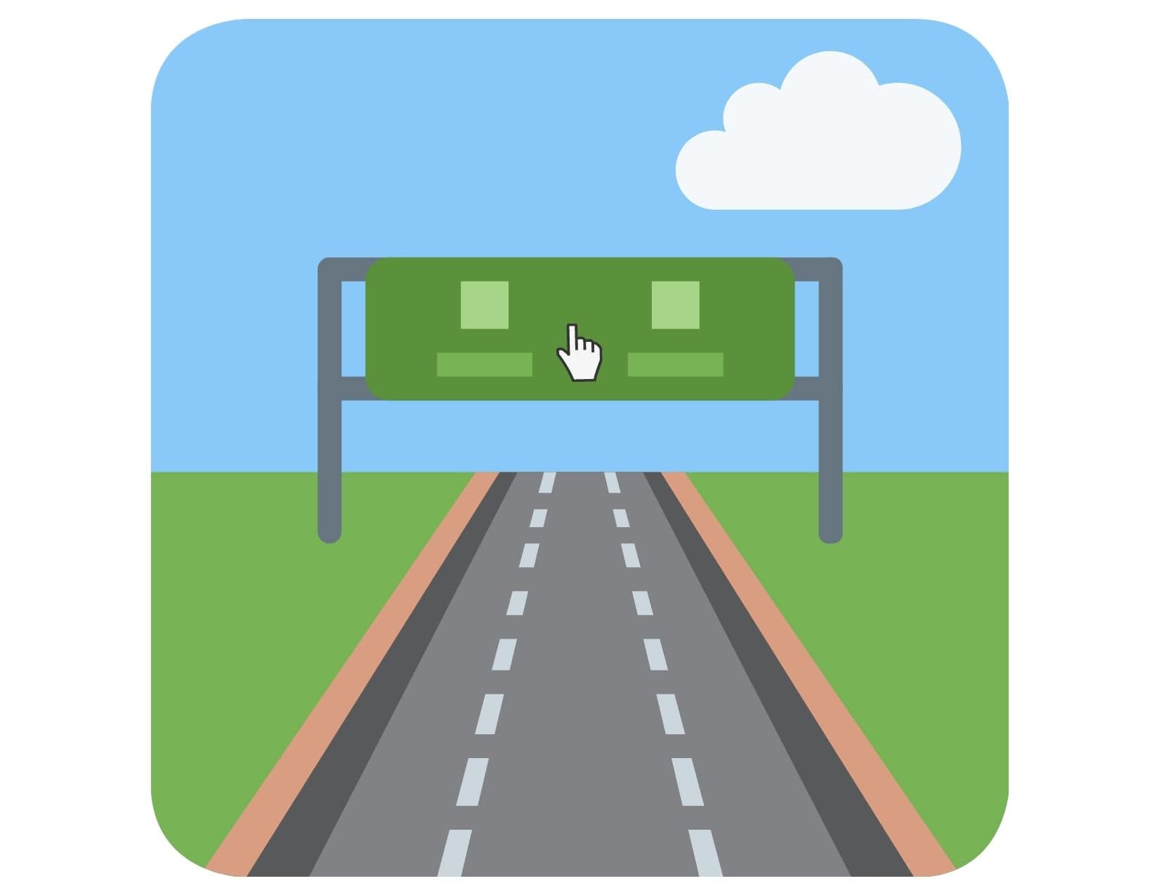
The web serves primarily as an information utility. People are looking for information. I remember back in the 90’s people referred to the World Wide Web commonly as an “Information SuperHighway.” This got me thinking -- what type of design is appropriate for a highway?
An engineer must consider how vehicle traffic flows when designing a highway and a website designer must take into account how visitor traffic flows on a website. Just as you enter a highway from many different exit ramps, the same goes for website traffic.
Highways have billboards of course, and plenty of signs. How many words can you read on a billboard when you are driving at 65 mph? Maybe 4 or 6, not much more. And as signs go, how many words can fit on road signs? Around 4 - 6 as well, sometimes more but usually not more than 10. So why should design for a website be different?
“Users have time to read at most 28% of the words during an average visit; 20% is more likely.” Jakob Nielsen, Nielsen Norman Group
A web page is like a pyramid, where the top contains few words and then as the viewer scrolls down there are more. Since search bots index text, long-form content is important to have, but above the fold should stay simple: minimal navigation and minimal text so people can actually read the text -- even while scrolling.
And what do people like to see most? When driving down the highway you look at eye-catching billboards or impressive roadside attractions. The same goes for websites: visitors look for imagery such as compelling graphics, photos and well-crafted videos, so be sure to include these in your design.
The New York Times, for example, is ruthless in the simplicity of their design for interior content detail pages, as well as the prominent imagery that helps tell the story:

Note the minimal ‘hamburger’ navigation icon (the small three horizontal lines at the top corner), then logo, then login, header, sub-header, then social icons.
And note below the fold there is only one column. No sidebar, no "calls to action," just a primary focus on the words and related images. This allows for a good user experience, which is one of the signals Google uses in its ranking algorithm.

A good website redesign will take into account how visitors will interact with it and how it can provide the best possible user experience to get your site get discovered and communicate effectively with potential customers.
Thinking about redesigning your website? Contact us for a quote.


with a Booster program for Healthcare companies.