Healthcare Survey Reveals Web Design Insights
Ready to boost your SEO ?

Healthcare Survey Reveals Web Design Insights
If you think your healthcare website design doesn’t matter to your audience, think again. Results from our Bartlett online healthcare website design survey show that poor website design can be costly for healthcare organizations. The survey revealed that 70% of healthcare website visitors encountered some type of problem when visiting a website. If you're considering redesigning your healthcare website now is a good time and here’s why:
During the pandemic internet usage rose 70% according to Forbes, and in 2021 the upward trend continues as more people look for healthcare information and services online. In addition to an uptick in internet traffic, Google just completed a search ranking update called Core Web Vitals that takes into account how visitors experience your website.
These metrics include performance, responsiveness, and visual stability, also known as the “page experience.” Google’s Core Web Vitals update resulted from analyzing factors that were important to people visiting websites, including how easy it was to use it. To test your site, go to the Page Speed Insights page and enter your website URL. If your healthcare website doesn’t pass the Core Web Vitals assessment, it can negatively impact your ranking and ultimately drive your audience away.
So which features should you consider?
Let’s look at what our own survey shows are the most wanted features your audience is looking for in a healthcare website design.
Make it Easy to Find Information

When asked how often people were unable to find what they were looking for on a healthcare website, an alarming 62% replied that it was some of the time and 24% replied it happened frequently.
Your navigation structure is one of the most important aspects of any healthcare website. It allows your visitors to locate the information they need quickly. When navigation is done correctly, that information will link to related information, which helps both the visitor and search engines. The more time spent on your website the better, since time spent on a website has been shown to be a positive ranking factor.
Since healthcare websites are known for having many pages with varied information, it’s a best practice to create content hierarchies that organize pages in an intuitive and visually appealing way. Make sure you include related content where appropriate. And use tags and categories to de-silo content, which helps both users and search engines locate related content.
Incorporating mega-menus is another way to group large amounts of varied content on your site. Visitors can access even the deepest sections of a website through a mega-menu.
On-site search is another way to enhance site navigation. 47% of respondents said they use on-site search frequently on healthcare websites, which means your website design should be able to handle different types of search terms and not penalize typos or plurals.
Mobile users frequently use search to navigate, so it's essential that your mobile search functionality works well. Incorporating autocomplete and alternate queries on the results page will allow mobile users to seamlessly navigate your site's content.
Make it Search Friendly
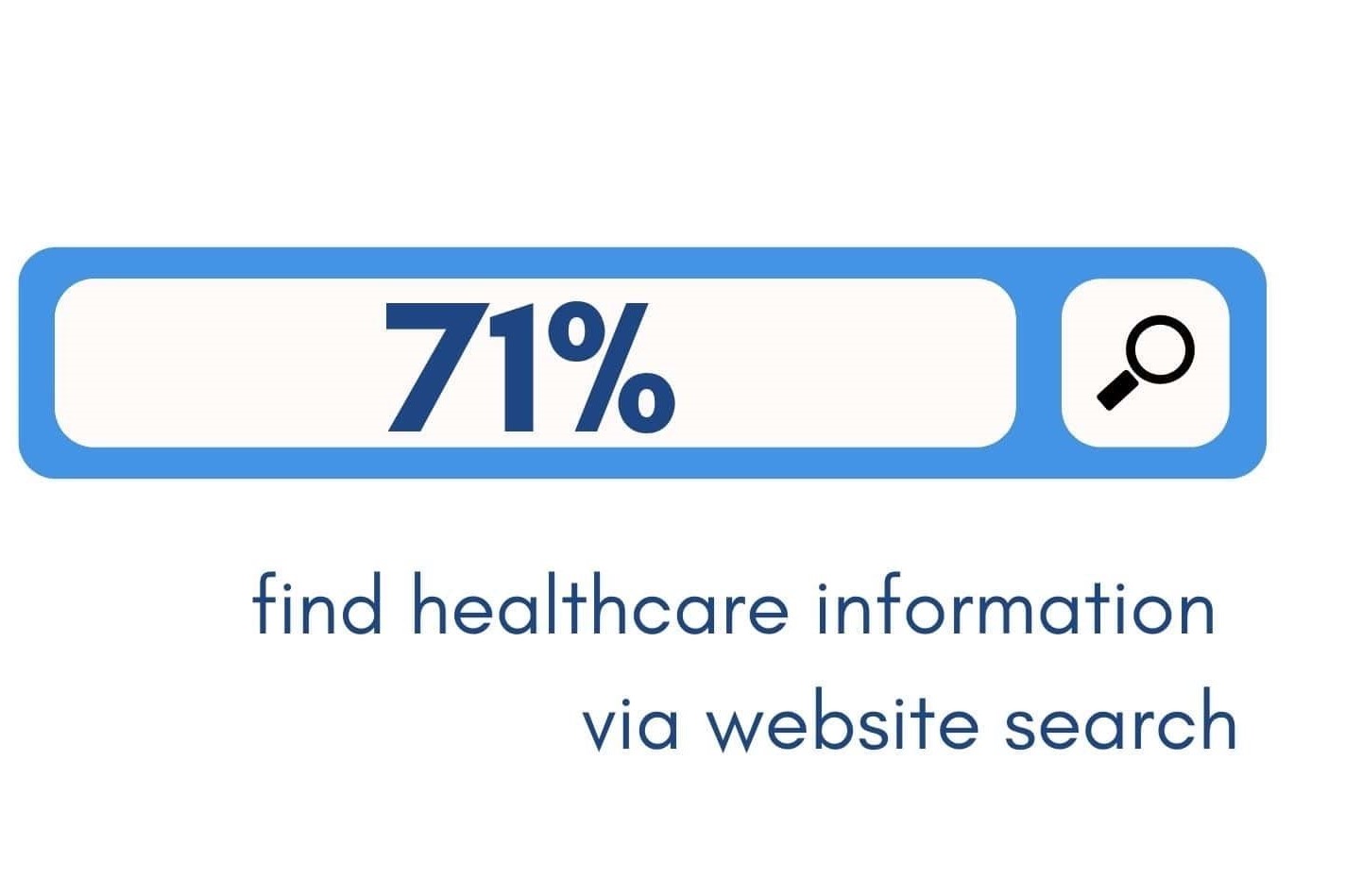
When asked how they find healthcare information online, 71% of respondents answered they find information via a website search, such as Google. This is why it’s so important to make sure your healthcare website design is SEO-friendly, and will show up in search results for healthcare related queries.
The healthcare information websites respondents visited most were WebMD, Health.com, MayoClinic. These large informational sites have all the elements that make them search-friendly, including intuitive navigation, quality content, compelling visuals, and pages that load quickly.
One way to make your website search engine friendly is to incorporate a “flat” website architecture. This means that your visitors can reach any page on your site in 4 clicks or less. To a search engine, fewer clicks means a better user experience, and we know a better user experience is an important ranking factor.
And make sure your pages are search friendly by using proper title tags, meta descriptions, and optimized images.
Provide High Quality Content
Once someone visits your site, what makes them want to stay?
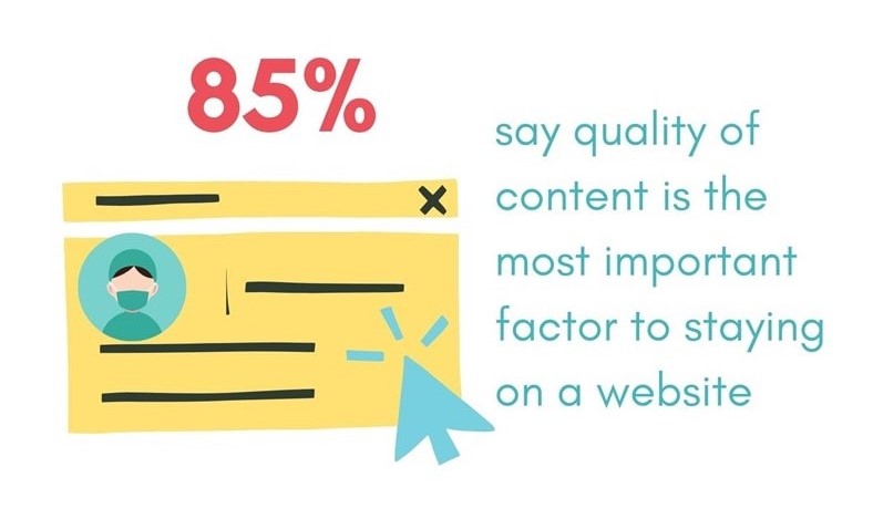
85% of survey respondents said that quality of content was the most important factor to staying on a website. And when asked what was most important when selecting a healthcare website, 29% chose credibility over other factors.
What are some of the ways you can ensure the content you provide is credible? Use recent research from well-known authors, academic experts or reliable sources such as the CDC or Medline.gov. Use citations when possible and avoid using unsubstantiated claims seen on social media or unreliable sources like Wikipedia.
People are spending more time online than ever before, so the content you provide has to be both in depth and credible to keep your visitors’ attention. Thin content doesn’t cut it anymore. In fact, the average word count for top ranking pages is 1,447 words. When developing content, it’s got to be informational and to the point.
Make It Mobile Friendly
Having a responsive healthcare website is critical. And when it comes to filling out a contact form on your healthcare website, making it mobile friendly should be a priority.
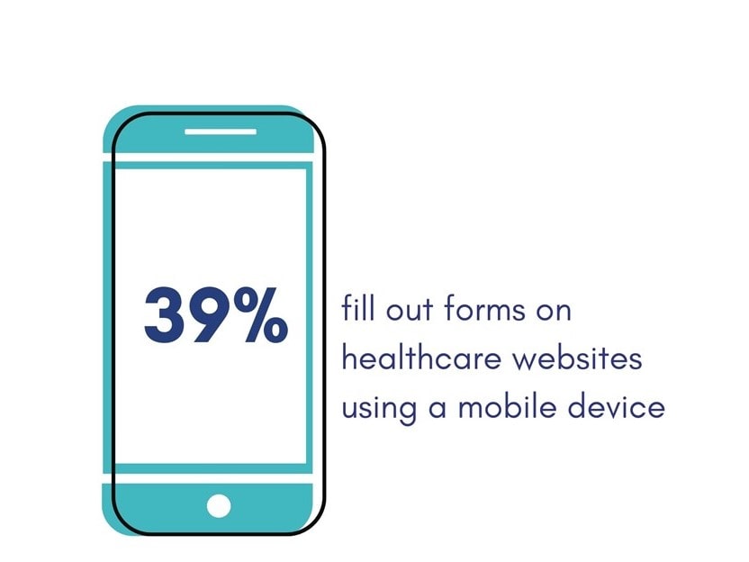
39% of our respondents said they fill out healthcare website forms using a mobile device rather than a laptop, desktop, or tablet. On small screens, interacting with forms can sometimes be frustrating because of poor design decisions. If your forms can't be accessed by mobile users, your lead volume could go down.
How can you improve your form design?
Use a single-column layout whenever possible. And when it comes to creating buttons, don’t put them too close to other elements, leave plenty of space so they can click easily. And be sure to test your forms on mobile for visual appeal and functionality.
Because healthcare website forms often need a lot of information up front, it may be difficult to cut back on the number of fields you use. To solve this, try creating several screens and keeping optional fields at a minimum.
Optimize for Conversions
Getting your visitors to convert (taking an action on your site such as subscribing to a newsletter, or filling out a form) is the main purpose for any website.
Having visitors schedule appointments is a goal for many healthcare provider websites. When we asked respondents what their preferred way of scheduling an appointment was, 28% chose email. Yet calling and texting were also popular options, suggesting the more ways there are to convert on your website, the more likely your visitors will convert.
How can you apply this insight to your healthcare website design?
The first place to start is your contact page, which is often the most-visited pages on your website. When a visitor wants to contact you, they intuitively look for your contact page and expect certain elements.
For instance, they expect a basic contact form with fields for name and email. But they may also be more comfortable emailing someone directly, so include at least one main contact email address. As our survey shows, the second most preferred way of scheduling an appointment is via phone, so make sure your phone number is prominently displayed on the contact page and on the main header of your website.
Missed appointments cost the healthcare industry $150 billion per year, so it’s a good idea to keep your bases covered with more ways for patients to stay updated. Live chat on healthcare websites is becoming an increasingly popular way to communicate with website visitors. And texting is the preferred method of communication for so many people now.
Since 24% of respondents also indicated texting as a way to make appointments, and 21% chose live chat, it makes sense to include these options in your website design.
Make it Visually Appealing
Of course having a visually appealing healthcare website is important, but what does that mean in terms of design?
Our survey showed that more than half of respondents found healthcare websites had too many colors or had complicated distracting graphics, and 70% said if the design is unappealing, it negatively affects time spent on the site.
We find many of our healthcare clients’ websites are the result of many features and design concepts cobbled together over time. The result is a confusing website experience that doesn’t rank well in search engines.
Start with a defined color scheme and stick to it. Choose compelling visuals and strong easy to read typography. Consider how your user interacts with your website as a way to inform its design. Make it simple for them to get information and connect easily.
This survey demonstrates the need for healthcare websites to make it a priority to be search friendly, visually appealing, and easy to navigate as well as provide high quality credible content. Making these changes can improve your search traffic, your visitors’ healthcare experience and meet your organization’s business goals.
 About the Survey: Bartlett Interactive surveyed 100 people in the U.S. in October 2021 to find out how they felt about healthcare design. View the complete survey here

with a Booster program for Healthcare companies.