Factors to Consider When Choosing a Website Color Scheme
Ready to boost your SEO ?
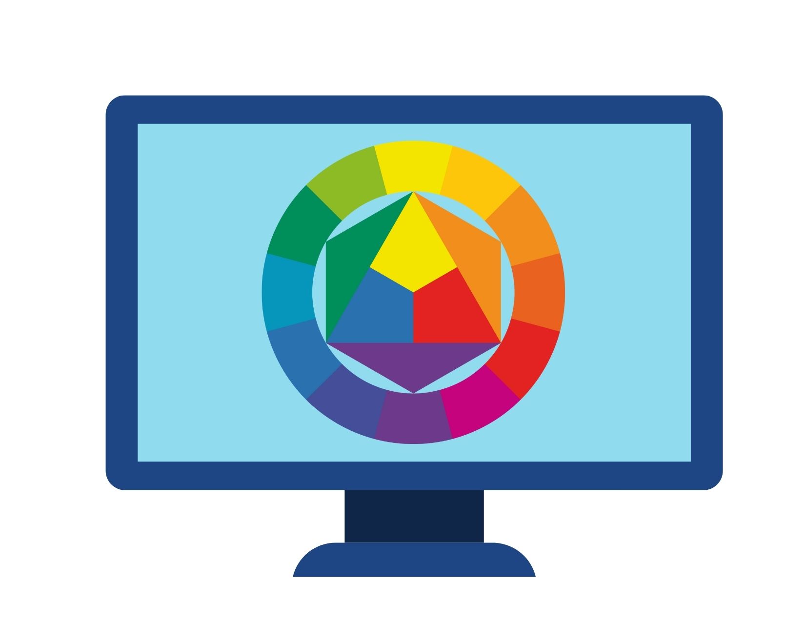
Factors to Consider When Choosing a Website Color Scheme
Is choosing a color scheme really that important when you're building a website?
Research shows the answer is a definite yes.
According to a survey conducted by Top Design Firms, 39% of consumers care more about website colors than any other element.*
So how can you choose a website color scheme that best represents your brand and encourages visitors to connect and convert?
Decide Who Your Your Target Audience Is
Think about who your target audience is and how they might respond to particular colors. Who makes up your target audience can have a strong impact on the colors you choose. And different groups may prefer some colors over others. For example, 43% of respondents of ages 18 to 24 like a purple color scheme in websites, but only 17% of people from ages 44 to 54 feel the same way.
If your audience is looking for a trustworthy company to manage their money or health, blue would be a good color to start with. The color blue is usually associated with calm, sincerity, reliability, and trustworthiness. It’s no coincidence that so many financial institutions use blue in their website color scheme to convey their core message of security and stability.
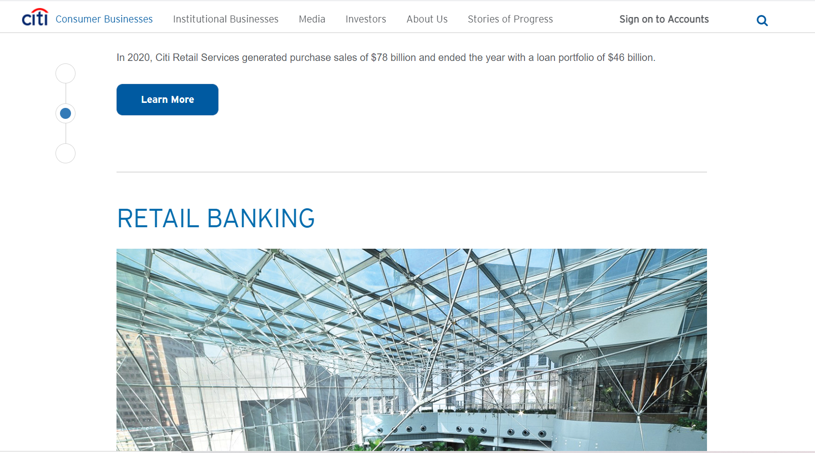
CitiGroup, for instance, uses a dark blue as their main color in the header, calls to action (CTAs) and side navigation buttons, but offset this blue with plenty of white space so the website has a more welcoming feel.
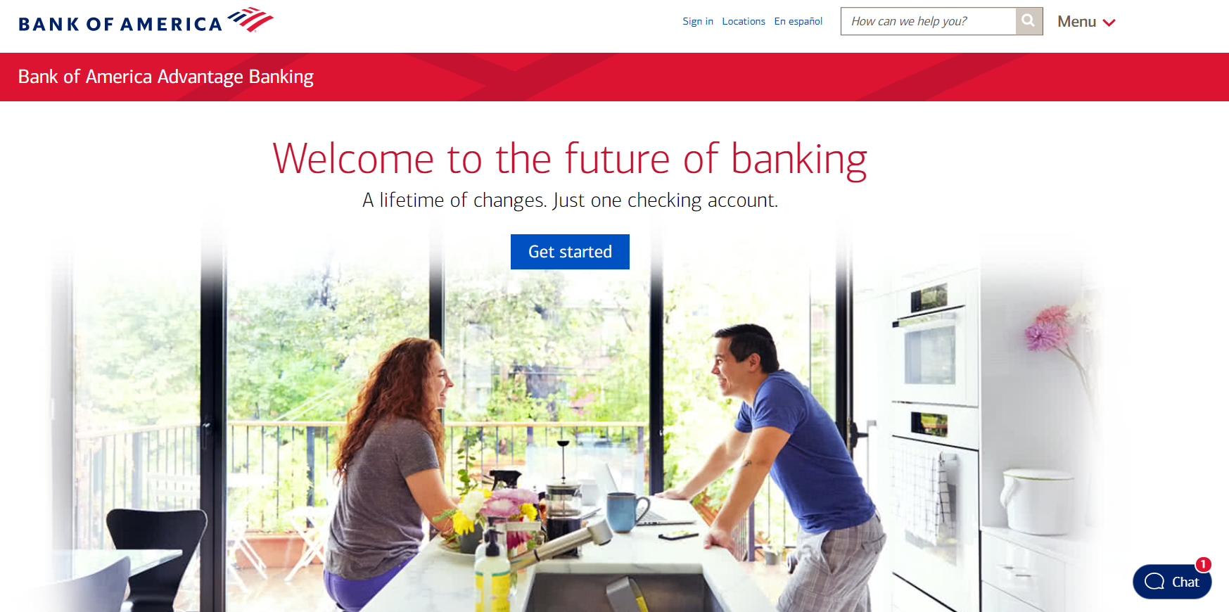
Bank of America has blue in its color scheme but they’ve also incorporated red and white to tie it in with their flag logo. In a recent brand update, Bank of America decided to go with a darker blue than in previous years to give it a more simple and modern look than the lighter blue they had before.
Your Website Color Scheme Conveys Your Brand Message
The right color can evoke a positive response from your website visitors, but it should match your overall company message as well. The color yellow, for instance, is a warm, positive color that is associated with optimism, but it is also the color of caution (such as a traffic light or caution tape). It’s an attention-grabbing color, so it can be effective for banner ads or for use in calls to action.
Using yellow in your website design does call for caution, as yellow can cause visual fatigue and should be used sparingly or paired with a more subdued color such as blue or green.
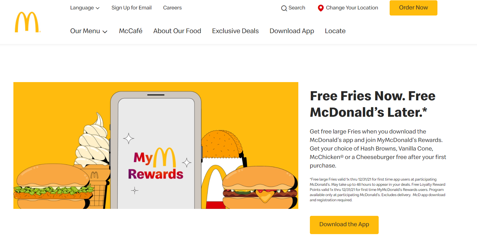
Some of the most popular brands use yellow in their branding, such as Cheerios cereal and McDonald’s. As you’ll see in the examples below, these websites mix different elements together so the yellow works with their messaging.
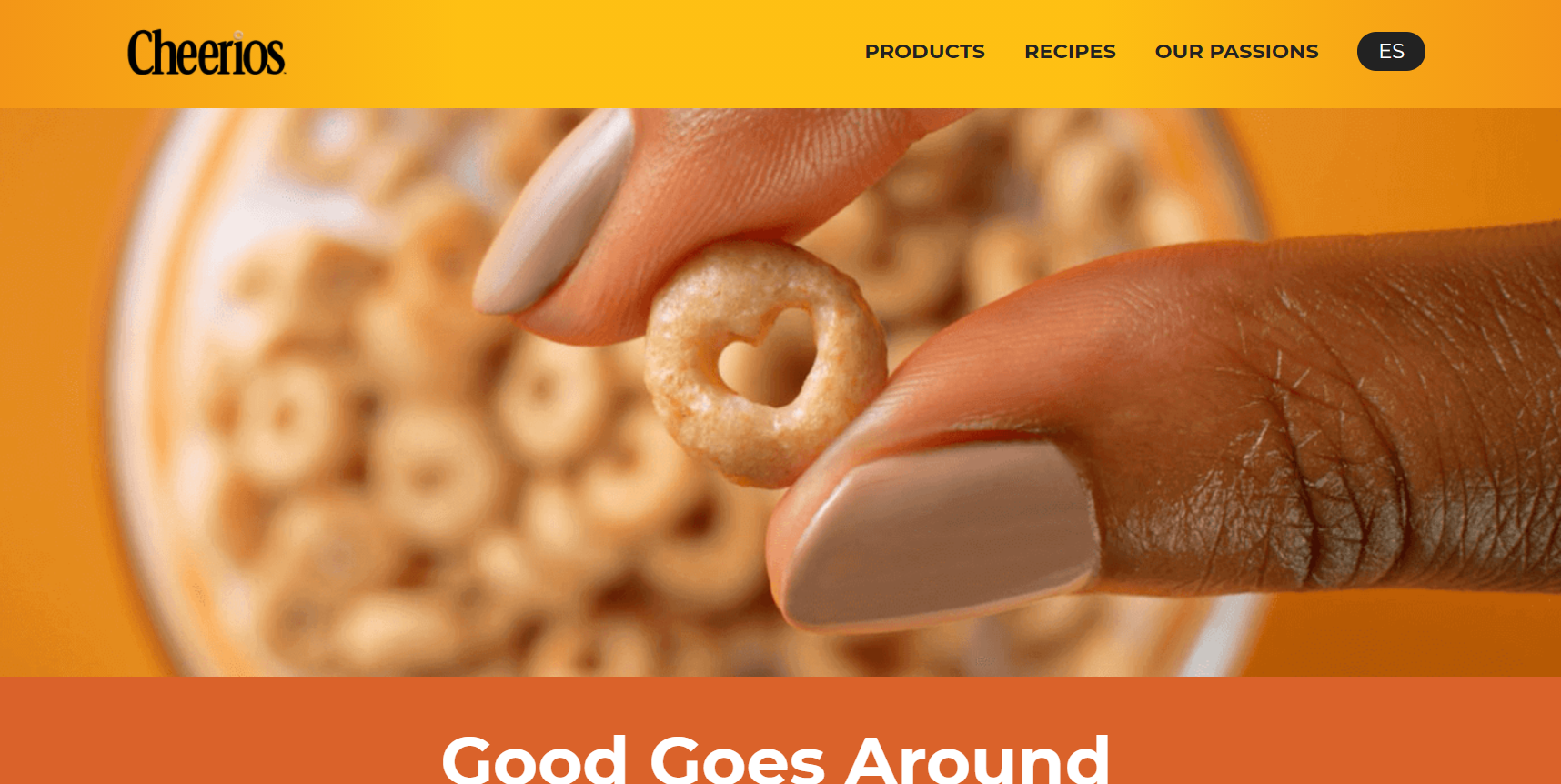
A box of Cheerios cereal is bright yellow, but you’ll notice how on the Cheerios website they have muted the yellow in their header by using a yellow gradient. The website also breaks up the brightness of yellow and orange by inserting a large closeup of their product between the color bars.
McDonald’s uses yellow sparingly on its website with a large percentage of white space in comparison to its graphic elements. They have even incorporated a large space between the navigation menu and the start of the graphic element to draw your eye down to the main hero area. The simple yellow CTAs really stand out in comparison to all that white space.
The Color of Money
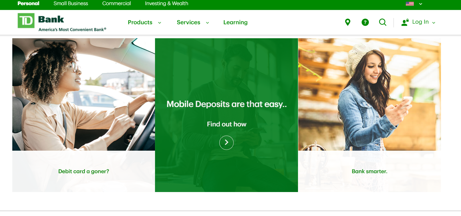
Green is the second most popular after blue in website color design. Green evokes peacefulness, growth, and nature. Many organic, natural, and eco-friendly brands use green in their website design. Most people associate green with good things such as nature and good health. In fact, almost 30% of men and 34% of women say green is their preferred choice of color on a website. Green, of course, is also the color of money, and is often used in website designs for financial services and bank applications such as QuickBooks and TD Bank.
TD Bank balances green with plenty of white space to give some vibrancy to what is an otherwise calm color and encourage visitor engagement. There is also a nice balance between using photo images and icons, where we see green again in their hover overlay effect on the image CTAs and for some bolded text they want to emphasize.
Colors Go Beyond Your Website
The color scheme you choose extends beyond your website. Think about how these colors will look in printed marketing materials your sales team will be using. Your color scheme will be incorporated into your company presentations, both internally and externally. Will these colors be pleasing to look at during a large conference or on an online webinar when people will be looking at the slides? For ecommerce websites, does your color scheme complement the products you sell and reinforce your brand?
You only have a second or two to convey your brand when someone visits your website. How that person feels about your website’s color scheme will influence whether they engage with your company or not.
Thinking about redesigning your website? Contact us for a quote.
*Source: https://topdesignfirms.com/web-design/blog/colors-increase-sales

with a Booster program for Healthcare companies.