Best Practices for Financial Services Websites
Ready to boost your SEO ?
Best Practices for Financial Services Websites
When creating websites for financial service companies like venture capital, wealth management, peer-to-peer lending and banking services, we discovered that less is, in fact, more. We strive for super clean UI and fast loading sites for optimal usability.
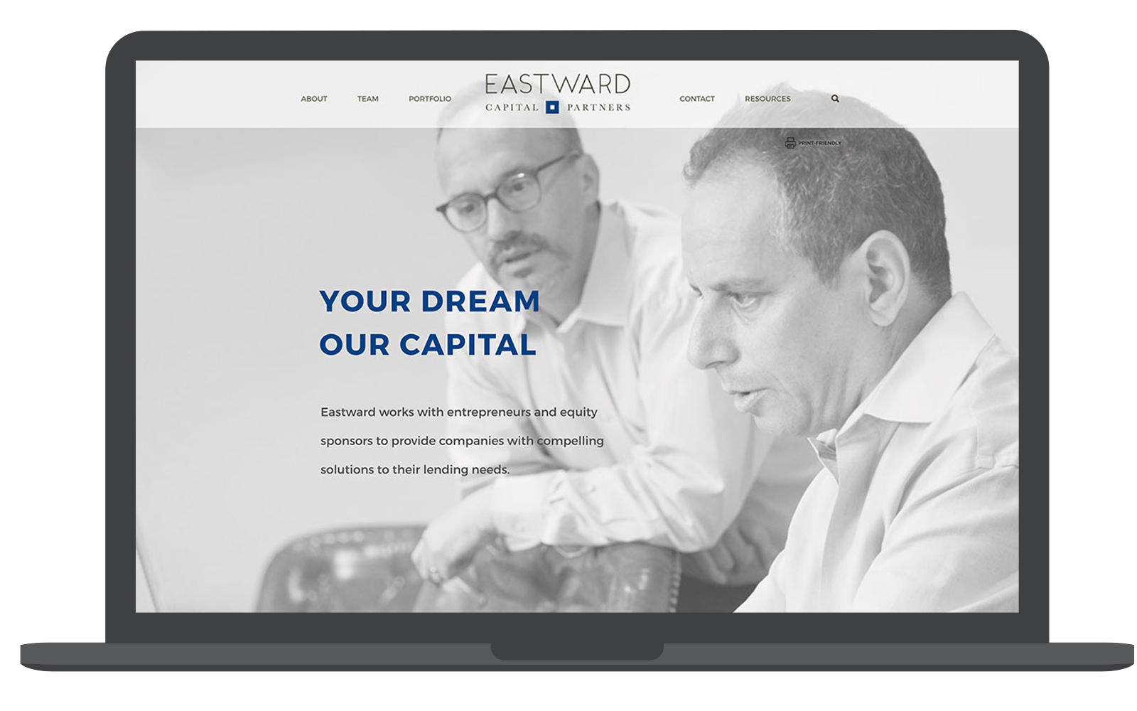
Our website redesign for Eastward Capital Partners is one such example:
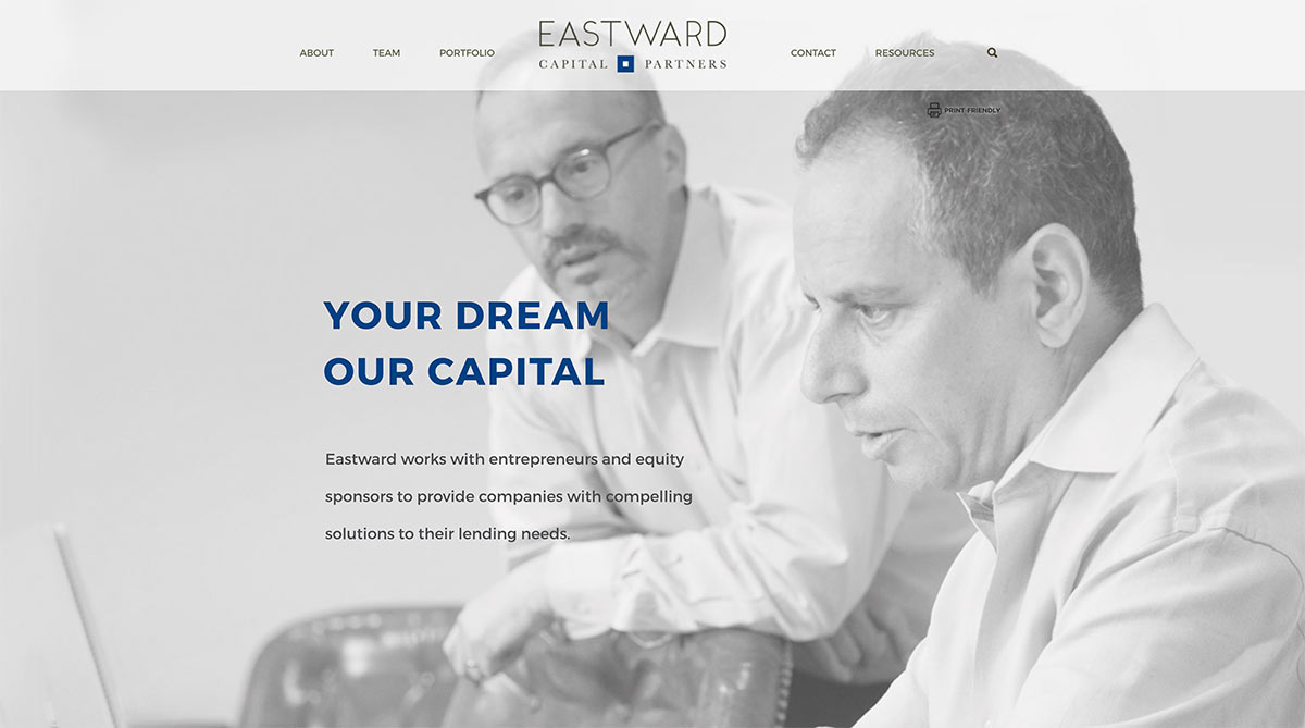
Navigation
The simple and uncluttered header area makes navigation quick and easy. Only the primary navigation, search tool, and logo are shown at the top. This simplifies the options for users for an inviting and clutter-free experience.
Photography
Full screen greyscale photos simplify the design by removing any visually confining borders. The images on this site are of actual people doing real things – no stock photography in sight! To capture the true personality of the Eastward office and team, the client hired photographer John Earle for an on-site photo shoot. Custom photography is well worth the investment as many financial websites can feel unapproachable and void of personality. The photography here helps evoke a feeling of friendly professionalism and their individualized approach.
Print-friendly
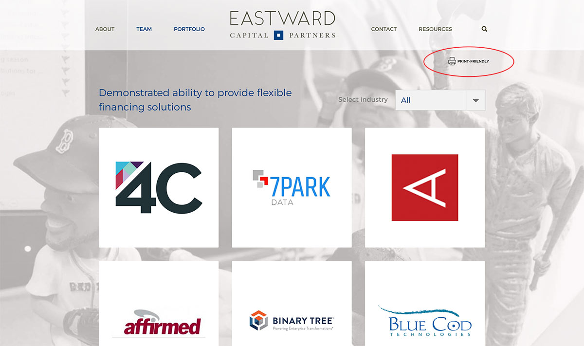
Print is certainly not dead in the financial industry. Printing numerous pages of information is commonplace, so it was a must-have to include a printer-friendly option for the Eastward website. This removes content such as background images or navigation to reduce paper waste and ink usage. The print-friendly link is clearly displayed where users can’t miss it.
Simple colors
Restricting the palette to two colors keeps the design clean and simple while reinforcing and strengthening the brand. Even though blue is a common color in the financial industry, the secondary color is more unique. This deep olive green communicates personality, a key brand attribute also exhibited through their custom photography. The subtle deviation from the unconventional color represents the uniqueness of the ECP team.
Contact form on every page
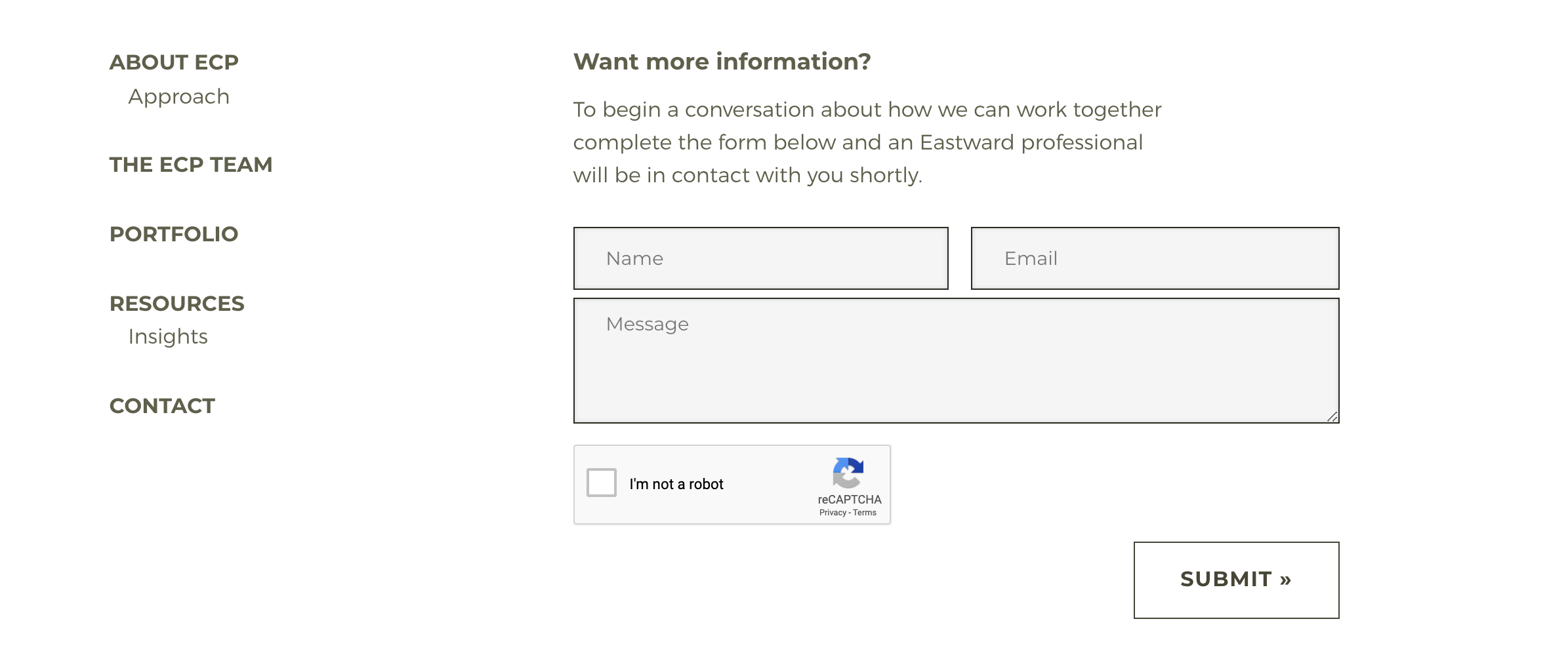
While this feature is common on many websites, contact forms on every page help to increase conversion rates. Users don’t have to hunt for a “contact us” page or deal with the various issues associated with html email links. The ability for a user to send an email to ECP from any page is fast and convenient, which is something everyone can appreciate.
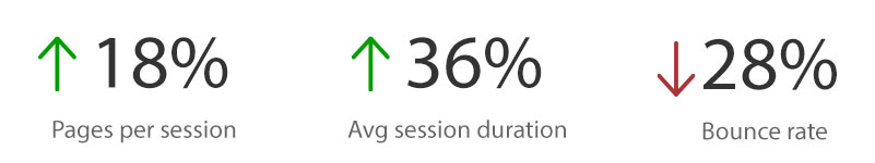
In a year over year comparison, average session duration increased by 36% and pages per session increased by 18% on the Eastward site. Bounce rate also decreased by 28%, indicating that more people are sticking around to explore what their site has to offer.
Simplicity for the win! Check it out for yourself.
Looking to increase your website traffic and rankings? Contact us for a free audit.


with a Booster program for Healthcare companies.