4 Recent Design Trends + Why They Matter
Ready to boost your SEO ?
4 Recent Design Trends + Why They Matter
What follows is a transcript of a screencast video recording.
Welcome to the "Trends in Web Design" screencast.
Today we'll cover:
1. Material Design
2. Recent Innovations Above the Fold
3. Row Based Design
4. Secondary footers
There are really two goals for this screencast: first, what's happening out there with user experience design, what's new, what's cool, what's mobile, what's easy.
And second more importantly why does this matter and how will it help your site perform better? Whether you are a business or a non-profit, we'll cover why a particular design trend can increase the value of your site. Let's take a quick look at some quotes:
"Judgements on website credibility are 75% based on a website's overall aesthetics." (see the study)
This is often taken for granted. Investing in design is a business decision and when done well, it pays off. And secondly:
"The average human attention span in 2000 was 12 seconds, by 2013 it was only 8 (less than goldfish)" -Microsoft Study
This ups the ante on why great design is needed more than ever.
Ok let's get started, first up Material Design.
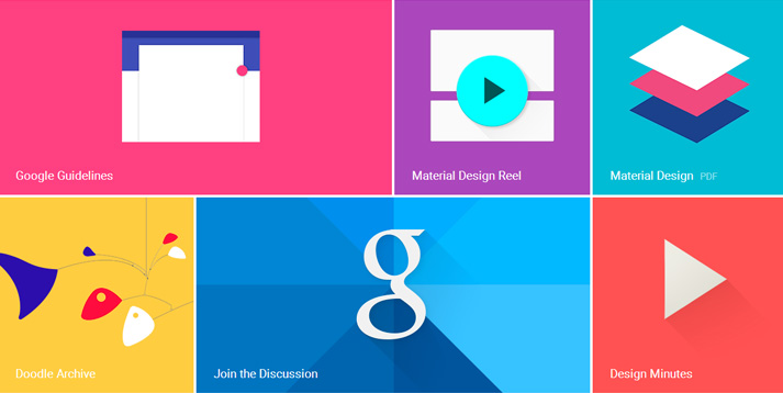
1. Material Design
This is a design platform created by Google a couple of years ago that uses CSS, JavaScript, and HTML to make websites more engaging.
It's a library of dynamic user interactions that add another dimension to a site for a minimal cost. Most of the interactions are for Google type content: events, movies, news, and weather but there are also great interactions for more basic things like forms, photo galleries, and tables.
As the Google designer Matias Duarte says:
"Unlike real paper, our digital material can expand and reform intelligently. Material has physical surfaces and edges. Seams and shadows provide meaning about what you can touch."
So why does this matter?
Code libraries such as Material Design reduce time and cost. They are public and free! They provide sophisticated user interactions that make for much cooler sites. The better the UX, the longer people will stay and the better your site will perform.
2. Above the Fold: Hero Images
Hero images continue to get more popular and stronger. These are the images on a homepage that live above the fold.
Here's a design we created for the software company Exa.
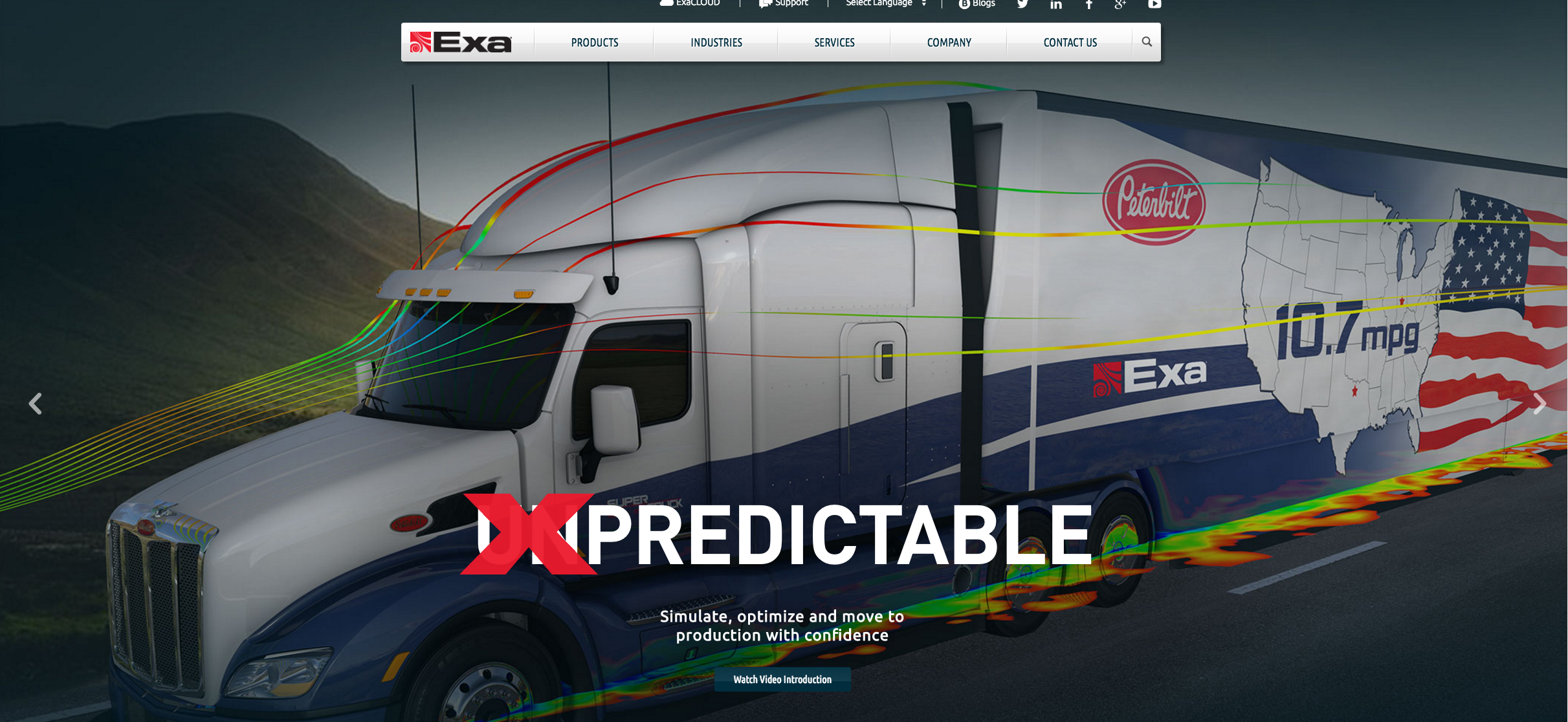
Note how simple the design is. One image, one headline and one call to action (or CTA). The image goes edge-to-edge, minimizing distracting and extra shapes. The eye moves across the page and is directed to the CTA which is the only white text on a dark background on the page.
So why does this matter?
The simplified layout directs the eye to the CTA, increasing the amount of CTA clicks. Once clicked, the visitor moves down the funnel, the more conversions, and the more sales leads.
Next Up: Hamburger Menus
A hamburger menu is indicated by three horizontal lines. It's typically placed in the upper right of the screen and is sometimes accompanied by the word "menu". When clicked, it expands-revealing the full navigation.
This example is for a site we created for the Concussion Legacy Foundation:
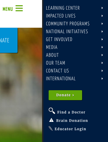
A hamburger menu simplifies the user interface while also increasing the amount of area for the menu to be displayed. And since mobile uses the same convention, it keeps the nav consistent on both desktop and mobile. Hamburger menus are sometimes criticized since they hide information, and testing has shown in some cases people spend less time on sites that only have hamburger menus. Much debate has centered on their benefit or liability, My take is they have some benefit (simplicity) and are an established convention that will not go away anytime soon. A hybrid approach of hamburger navigation and traditional tab navigation is often the best approach.
So why does this matter?
The more efficient the layout and the information architecture, the better the user experience. This increases the emphasis on the content and CTAs which in turn will improve site performance.
3. Row Based Design
Row based design is comprised of rows, not columns. Columns with different content compete with each other. Content shouldn't compete with other content! A row based design only shows the user one message or type of content at a time, delivering more impact.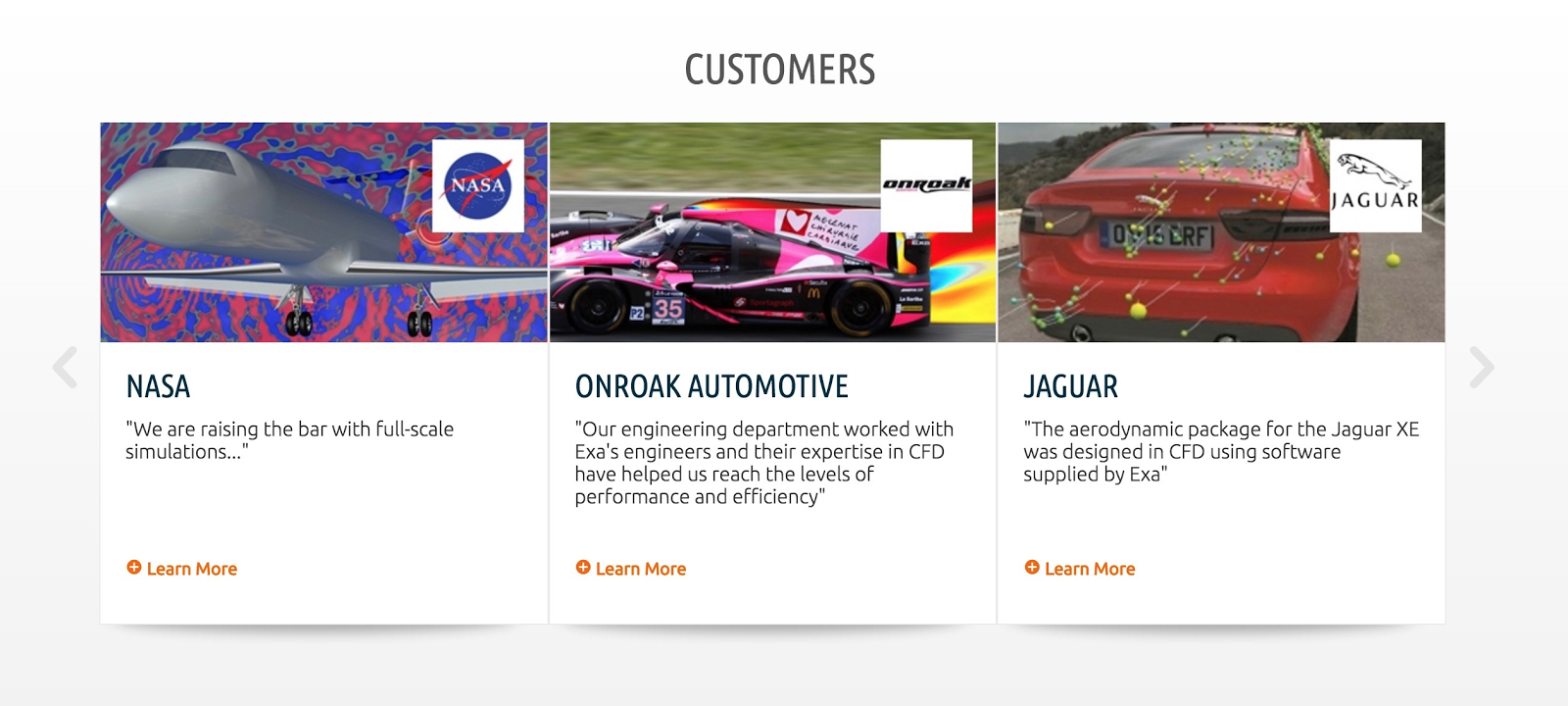 This example is part of a Home page design we also did for Exa. It combines a row based design with a card style as well as a horizontal scroller. Note there are columns here but they're all about the same thing: Exa customers. Row based design does require scrolling. Usability tests have proven people like to scroll as long as they are rewarded with satisfying content. The idea that content should be "above the fold" to reduce scrolling results in overly complicated layouts and should be avoided.
"Infinite scrolling can lower your bounce rate. Time.com's bounce rate dropped 15% after they adopted continuous scroll."
So why does it matter?
Again, the better the UX, the longer people will stay, the better the site will perform and the more leads will be generated.
4. Secondary Footers
This is a new term for a call to action above the footer. The idea is if a visitor has made it to the bottom of a page, they are more likely to be a qualified prospect, so placing the CTA at the bottom of the content container is an effective spot. This isn't always the case, however. Sometimes it's best to have the CTA above the fold in a sidebar especially for sites that have simple product offerings, where you want to convert right away. This example shows how secondary footers are beneficial. Note the one column layout increases the prominence of the content. The text and photography can go edge-to-edge with no sidebar. And there's plenty of room for the CTA or, as in this case, 3 CTA's
So why does this matter?
The better the CTA placement is, then the more conversions. And there's no need for a sidebar or multi-columned layout, so the design is cleaner. I actually read that Google ranks one column layouts higher since they are more content-focused.
So there you have it. Four design trends and why they matter - making the business case for great design.


with a Booster program for Healthcare companies.