3 Must-Haves for Healthcare Website Design
Ready to boost your SEO ?
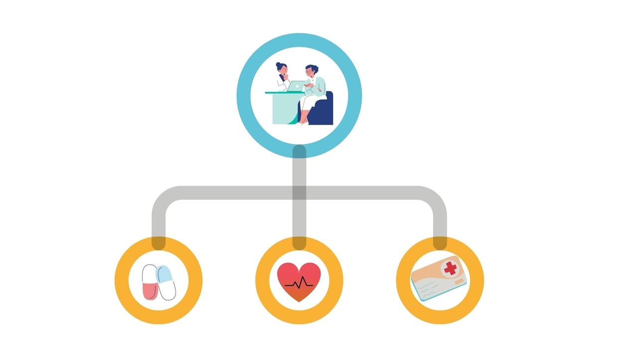
3 Must-Haves for Healthcare Website Design
There are 3 must haves for healthcare website design and for each one, key questions to ask to help you decide which direction to take.
Healthcare companies have a wide variety of users visit their website. When we ask our healthcare clients, who is your target audience, the feedback we often get is it can range from healthcare professionals to patients to investors, and can include many age groups and demographics.
So how can you get your healthcare site to appeal to everyone?
Here are examples of how to use these 3 must-have features for healthcare website design:
1. CTAs To Engage Your Audience
Calls to Action (or, CTAs) are used to direct users to your marketing campaigns. If you have a blog section, newsletter signup, or anything else that would prompt your audience to interact with your site, you’ll see an uptick in engagement when you use a CTA.
Examples of CTAs for healthcare websites include: Make an Appointment, or Find a Doctor.
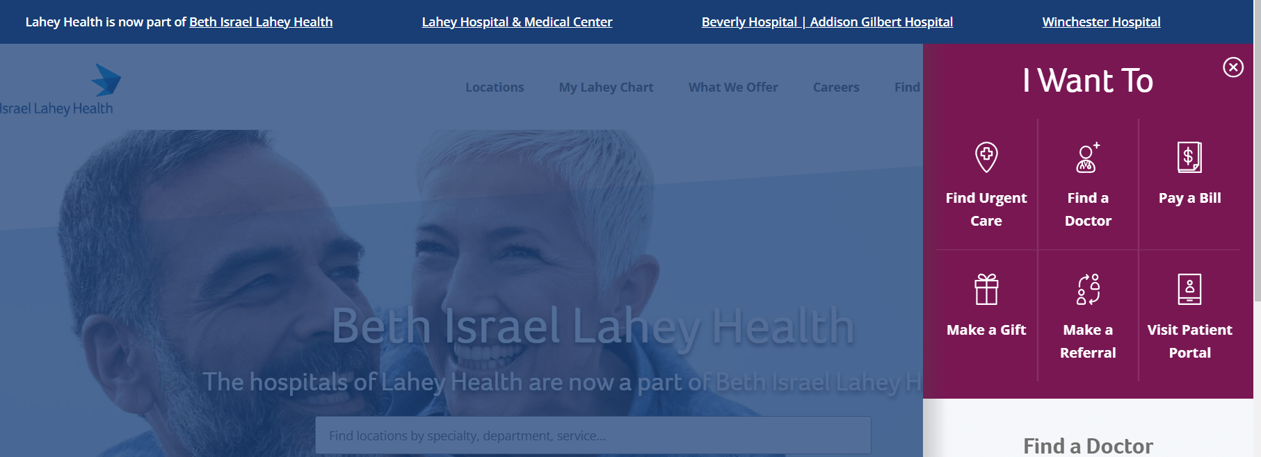
The Lahey Clinic, for example, uses a top level CTA, with the text prompt “I Want To”. When a user clicks it, the menu opens up to a selection of different actions the user can take. It’s off to the side so the viewer can still read the content on the page, but can quickly jump to another section depending on which type of audience they belong to.
To develop an effective CTA like this, ask yourself these questions:
- Who will be using these CTAs?
- What does that audience want to accomplish when using this CTA?
- What metric do you want to measure when assessing your KPIs (Key Performance Indicators)?
- Why are you placing the CTA where you’re planning to place it?
- Why would your audience care about this CTA?
2. Visual Storytelling to Connect to Your Audience
If you want to reach your audience, find the right imagery to connect to them. Generic stock photography won’t do. Your healthcare website needs to convey trustworthiness, and reassure visitors that your organization is the right one for their needs.
Using diverse imagery is important so that users can relate to your website. The photography should have a variety of genders and backgrounds represented.
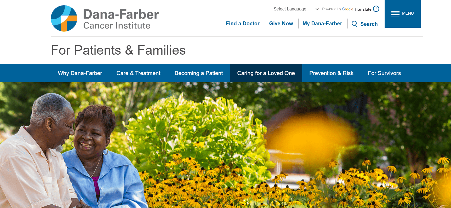
The Dana-Farber Cancer Institute provides adults and children with cancer treatment and develops new therapies through their research. The image they use on their section for caregivers of cancer patients evokes both hope and caring.
We see a couple sharing a private moment in a sunny garden. This image reassures the audience that they are at the right place to get information on how to care for their loved one who has cancer. It also appeals to their emotions, showing a real couple in a warm, supportive environment.
To choose the right imagery for your healthcare website, ask yourself these questions:
- Who is being represented in this imagery?
- What will the user connect with in this photography?
- Why will the user care about this image?
3. Sitemaps to Guide Your Audience
When structuring a sitemap, you want to make sure your content is easily navigable by any of your users. The first step in building a sitemap is to identify all of your types of users and ensure there is an easy user experience (UX) pathway for them to follow on the homepage and in the navigation.
If your visitors can’t find what they need, they won’t hunt around for it, they will simply leave.
When you provide an easy to understand, well-defined navigation they are more likely to stay and convert.
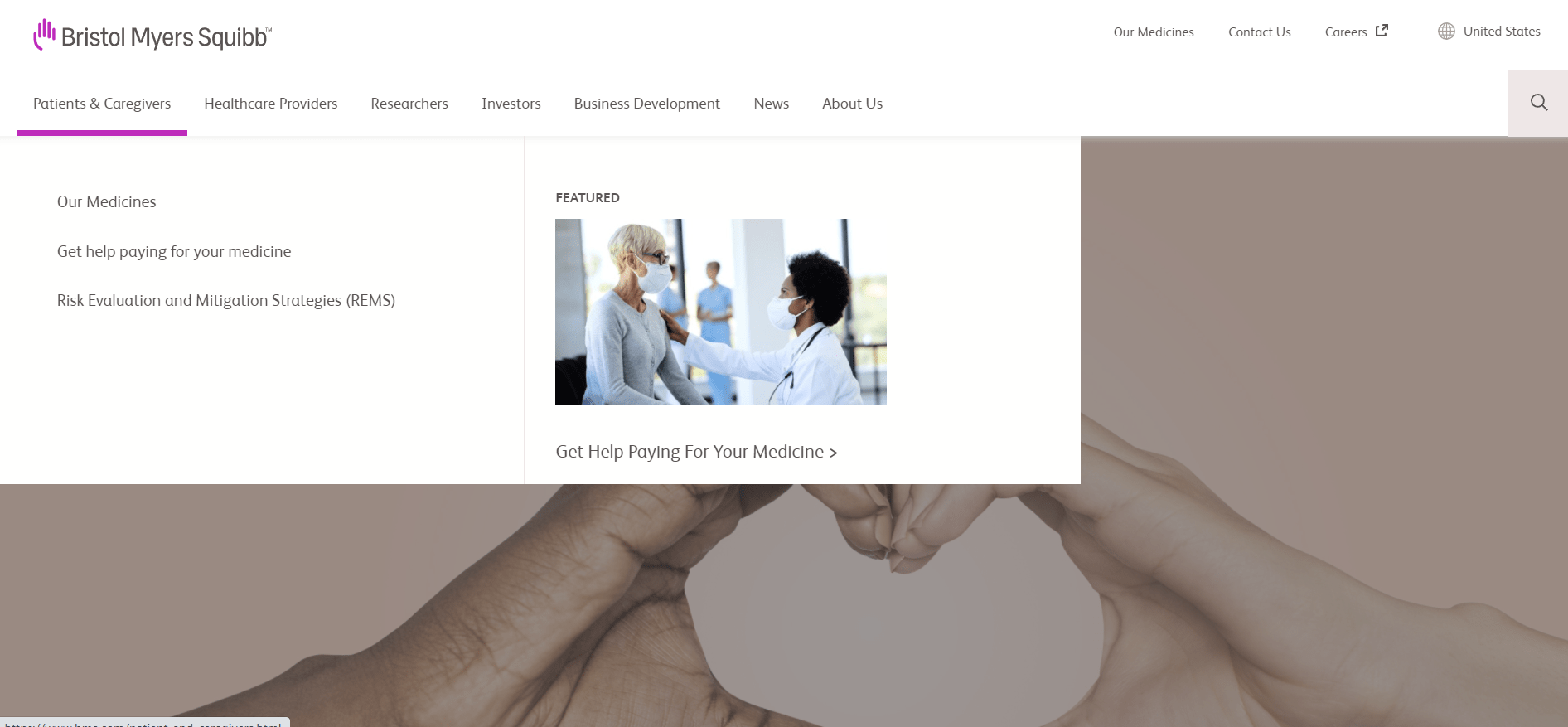
Bristol Myers Squibb is one of is one of the world's largest pharmaceutical companies, and like many healthcare websites, has a large variety of audiences.
To guide visitors, the sitemap they created helped them to develop a large expandable navigation menu (known as a mega menu) which opens up to sub categories for ease of selection. They also have incorporated a featured menu item within the mega menu with a graphic. This helps to further guide the visitor down a path to getting the information they need.
To develop an easy to use sitemap ask these questions:
- Who will need to be directed where?
- What parts of the site need to be represented in the sitemap?
- Why is certain information being grouped together?
Using these three must-have features will ensure any visitor from any of your healthcare audiences will be able to relate to your site and engage with your content.

with a Booster program for Healthcare companies.