How Branding and UX can Increase Conversion with B2B sites
Ready to boost your SEO ?

How Branding and UX can Increase Conversion with B2B sites
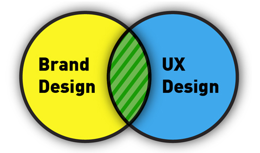
It’s important to consider the overall branding and User Experience (UX) design when looking to increase leads and conversions.
A while back we redesigned a site for MicroE Systems. MicroE is a very successful OEM that develops encoders for use in high tech manufacturing. We designed their original site around 10 years ago as well a newer one more recently.
NOTE: The newer design produced over 200% more new leads per month than the old design.
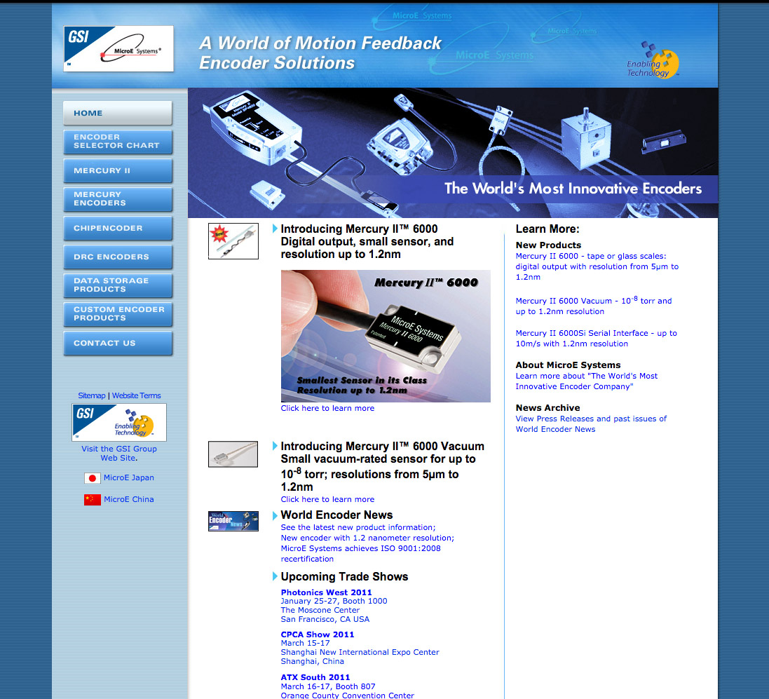
To understand why, let’s first start with the old design. We designed this layout, though it was around 10 years ago, so you’ll have to cut us some slack. Note the overall dark blue design with white text and a minimal amount of imagery.

Now let’s look at the new design.

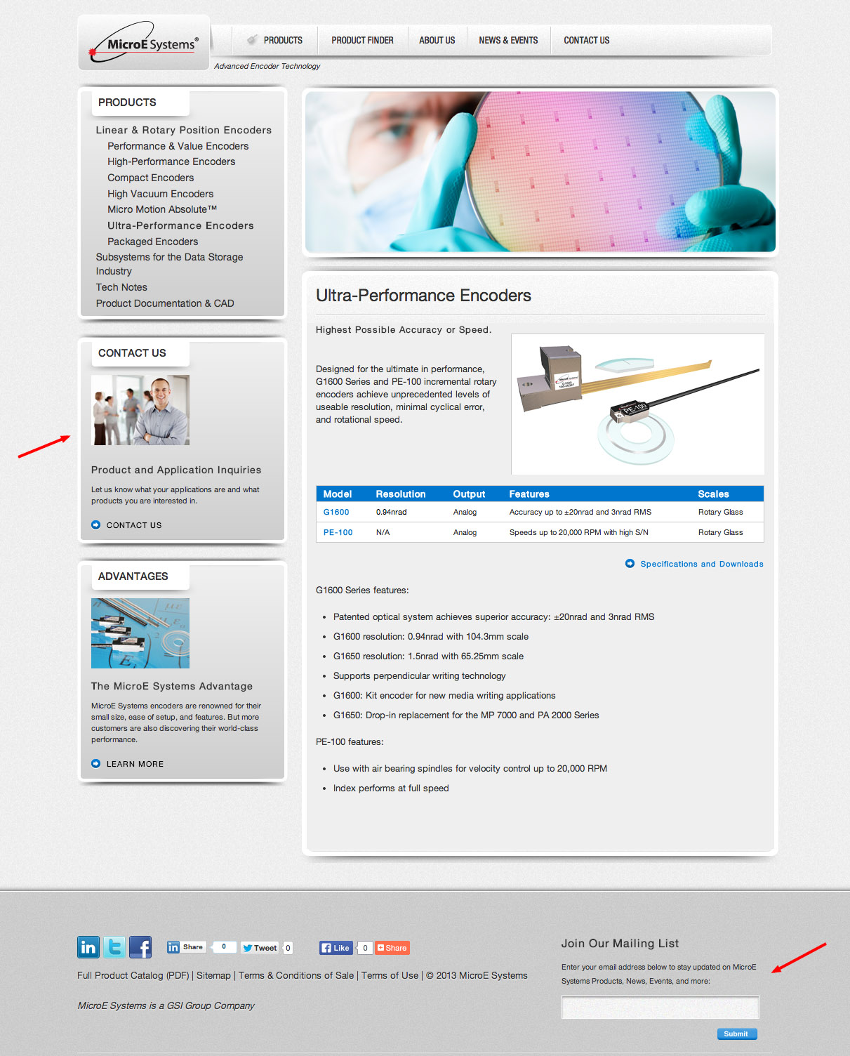
Note that the new design is much lighter and that there is a photo with the call to action. Here are some reasons why I think the new design is better and why it has produced many more leads than the previous version:
- Lighter: Technology sites used to look dark because it was thought darker layouts were more dramatic. However, people don’t necessarily want more drama. They want to understand the content. Lighter is more open, easier to read and more emotionally uplifting.
- More personal: The addition of a photo with people in it in the Call to Action block is critical to the success of the page. People relate to people more than than they relate to objects. Brands need to have personality in order for viewers to connect positively.
- Call to action: The CTA photo is warm, inviting and not your typical stock photo of the beautiful woman smiling at the camera.
- Limited use of color: This makes for an easier-to-read page. People respond in less than a second to color, before any other visual part of the page. There should be less than 3 colors on a page.
- Easily distinguished islands of content: this ‘island’ based layout is already a bit dated but it still makes for an easy to understand page.
The combination of the lighter color pallette and photos with people humanizes the overall look and feel. I think this is really important to keep in mind. People buy things from other people, even B to B OEM products like Encoders. The more human a design can be, the more people will respond as long as it has a supportive role and doesn’t overpower the primary message and content.
The increase in leads from the new design has as much to do with the overall brand look and feel as it does with the mechanical aspects, such as making the CTA block more prominent. Note that the CTA block could be improved by having the form fields on this page not requiring another click to the conversion form.
TAKE AWAY: Branding and User Experience design directly impact the amount of leads/conversions a page will have. This is often overlooked and should be considered whenever leads are a goal for a site.
Related blog post: SEO is Branding
Related Glossary terms: User experience, Conversion
Interesting related statistics:
- Most websites don’t have a massive traffic problem, however every website in the world has a conversion problem. (Source: Bryan Eisenberg)
- Conversion rates increase when your goals and your users’ goals meet. (Source: Conversionista)
- A/B testing is the most used testing method for improving conversion rates. (Source: Steelhouse)
with a Booster program for Healthcare companies.

